Monday, December 12, 2011

Week 9

Vocabulary:
Pentimento- A visible alteration in a painting where the artist has changed the piece and there is still evidence of the original in the piece.
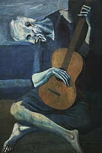
The Old Guitarist 
1903 
Pablo Picasso

Chiaroscuro- A style of art which uses stark contrast in painting, used to suggest volume and modeling of subjects.

Sacred and Profane Love
1602
Giovanni Baglione

Contour line- a line that defines a form or edge, essentially an outline


Complimentary color scheme- A color scheme that is based off of two colors that are opposite of each other on the color wheel.


Analogous color scheme- A color scheme that is based off of two colors that are next to eachother on the color wheel.

Untitled
Chris Carter

Monochromatic- Art that is in one color, or shades of the same color.
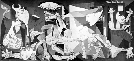
Guernica
1937
Pablo Picasso

Iconography- The use of or depiction of popular subjects in terms of the content.

Tikhvinskaya
ca. 1300

Iconology- The study of icons or symbolism in art.

The Holy Trinity
Vladislav Andrejev

Foreshortening- A visual effect where an object appears to be far shorter than it actually is.

Dead Christ
1501
Andrea Mantenga

Crosshatching- Lines that are placed at an angle to eachother.

Veil of Veronica
1513
Albrecht Durer

Modernism- A set of cultural tendencies revolting against realism and tradition, in favor of abstract, unconventional art.

The Gate
1959-60
Hans Hofmann

Post modernism- Movement in reaction to modernism, usually characterized by references to classical art, also the use of words, collage, simplification are used.
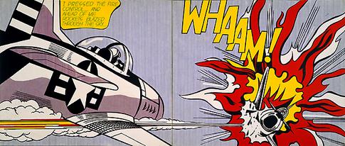
Whaam!
1963
Roy Lichtenstein

Picture Plane- The front of the surface or image in reference to the illusion of depth

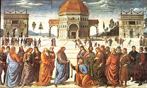
Christ Handing the Keys to St. Peter 
1481-82
Pietro Perugino

Foreground- A part of the view which is nearest to the observer.
Middleground- Area of a piece that is between the fore and background.
Background- A part of the view which is farthest to the observer.


                   The Adoration of the Magi
                                     1481
                                   Da Vinci

Week 8

Model Drawings:

I really enjoyed drawing the models, it is a challenge. The contrast between proportion and space, and anchoring the model in the space, is a constant challenge especially with poses that are under a time constraint. These constraints forced, at the suggestion of the teacher, to try a new style of drawing. I like to draw with light, short strokes to mask out a picture, but this technique is not as applicable to model drawing as others. Mrs. Rifka suggested that I start with strong long strokes that place the body on the page and work from there. I found that this method worked really well and allowed me to complete many of the drawings before the end of the pose. I also feel like this style made me more confident in my proportion and original masking of a piece.


Henri Matisse:


Matisse's interpretation of his subjects are characterized by strong dark outlines in an extremely flat nature. we see that the characters are place at different depths in the painting, but they are still flat. His figures are also anchored in the piece, a general trend in his pieces, with detailed and layered backgrounds.

Week 7

Considering Hans Hofmann's Legacy:


"A work of art is a world in itself reflecting senses and emotions of the artists world."
Hans Hofmann 

"Being inexhaustible, Life and nature are constant stimulus for a creative mind."
Hans Hofmann

Much of Hans Hofmans work is based on the idea of using contrasting color, shape, and surfaces to evoke pictorial space not in the traditional manner. This is exemplified in all of his work but in this particular piece too. Some of his quotes are exemplified though this work to, such as the two quotes above. Certainly the artwork describes something about the artist, what he is thinking, and his emotion. Through the stroke, spattering, and color, we can detect how and what the artist is thinking and feeling; not only in the piece, but as he is painting or creating the piece. The second quote applies to this piece too, the work or works, can be stimulated by anything in the world, and some would argue that art and the inspirations for art can only come from the outside world. As such art can also stimulate more art. 

This work is based off of the basic ideals that Hans Hofmann art revolves around, while I wasn't playing with shape or surfaces, I was playing with color. I was working on a blue to orange color scale, the blacks being equivalent to orange and the blue equivalent to light. It's a very interesting way of working and takes a moment or two to get used to. I found myself wanting to make the things that are are actually blue, blue and not just playing with the light and shadow. I like the effect that is has on the work though, the different color scale certainly makes you think about what you are seeing more. 

Week 6

Quotes form Cezanne and Illustrations.

1) I am old and ill, and I have sworn to die painting.


The quote from Cezanne is stating that you are never to old to express yourself. The first thing that came to mind when I read this quote was Cezanne as an old man, determined to keep going forward, so that's what I drew. The focal points are the inset eyes that are looking straight out of the paper, challenging the viewer.


2) With an apple I will astonish Paris.


This quote expresses simplicity, that the simplest things can be beautiful. An apple is nothing, but if it is simply beautiful than it will amaze anyone. I wouldn't call my work amazing, but it expresses the simplicity, it is an apple, with basic shading and coloring.


3) An art which isn't based on feeling isn't and art at all... feeling is the principle, the beginning and the end; craft, objective, technique - all these are in the middle.


I like this quote because the most expressive at that I have seen has a basic emotion or feeling linked to it. I recently saw a Picasso of a mother holding her child, and that was the first thing that I thought of when I read this quote. This is a recreation of the piece, you can see and feel the love and gentleness in the mother, and the connection between mother and child.

Week 5

The Hand:


Hands are one of the if not the most expressive part of the human body, and must be studied accordingly. Line weight, style, movement, position, all have to be considered when drawing hands. The viewer, can feel the interaction and the pressure which with the hand grasps. You can also infer a lot about the subject form the hands, specifically from the musculature, knuckles, veins, fingers, nails, and hair. 

My hands are drawn from my own hands, either modeled or pictures, you can see the how the darker lines create a more expressive hint when looking between the middle and lower hand, denoting pressure and separation from the cup that they are holding. The use of shadow is also important when drawing and incorporating hands into a piece. In this piece shadow both denotes relative layers and faces, but also expresses dimension, note in in the middle hand between the middle and index fingers how the middle finger seems to separate from the cup. 


Friday, October 21, 2011

Week 4

Perspective, Considering Proportional Figures:


During week 4 we examined perspective and as I have done some perspective work in the past, I tried to work in three point perspective. We considered, proportion, and proportional figures during this class, focusing on the "head" system, using seven and a half heads as a standardized measurement to draw a proportional figure. 

This is probably my favorite piece of the class, though still unfinished.  It is modeled after the idea of Atlas holding the world, but assigning an "Atlas" to hold up every heavenly body. Essentially, it will be a solar system of Atlases in a great hall holding the planets and the sun. The first Atlas is holding the Sun and is the focus of the piece, he is done in three point perspective like the others but is the most detailed Atlas.

The use of three point perspective I found to come pretty naturally and up until the head and arms, the piece was going relatively quickly. The placement and orientation along with the scale of the head presented some trouble due to the differences in unit lengths as you become as close to the top vanishing point. After a few tries I feel like I have come up with a good scale and orientation of the head and face. 

The arms also gave me trouble, specifically their orientation, linear proportion, and musculature. I had to put more vanishing points into the piece to get what looked like more of the correct perspective. The hardest part was modeling it out in 3D on a 2D surface, so that it looked real. Not only did the length of the bones changed but the width and girth of the cylinder representing the arm changes along the length of the arm. The musculature also proposes a significant problem with their complex shape and applying it into a perspective is difficult, especially for the forearms. 

I like how the first figure turned out the perspective, and arms that gave me trouble, work really well in describing just how gargantuan the figure is. I intend to do the rest of the figures and then detail the planetary bodies, and finishing it off by placing it in a great hall modeled after a cathedral with traditional architecture.

Week 3

Goya and the Use of Light for Emphasis:


During our third week of class we examined some of Goya's Caprichos (two shown above). We spent a good deal of time during class looking into the use of light for emphasis and the movement of the light in a drawing to convey mood and manipulate how the observer looks at the piece. On all of these techniques, Goya is truly a master. 

The use of light and dark goes beyond shading, and expresses a mood of the figures in the pieces. Examples are the characters in the first Capricho and the beasts in the second. The moods and the intentions of the characters, in both examples are emphasized by their color and how dark they are in contrast to the rest of the piece. 

The use of light in the pieces also express the movement of the characters also brings the eye across the composition. In the first piece, we see the movement of the beautiful lady, as the eye is pulled across the page and drawn to the right side of the piece where it is the lightest. 


This piece was inspired by Goya's Caprichos, using like techniques with shading and the use of light to bring more emphasis out of the piece. I used light as an equivalent to "purity" in the piece and the black as the polar opposite. I'm not really sure what the main character is doing, but it was inspired by Capricho #43, and mimics the beasts above, with the faces of judging characters.

For this piece, I used basic shading and outlines to give my figure proportion and a basic look, working out early ideas before I started heavily shading. After the basic layout of my drawing I shaded and emphasized the feelings of the characters with unrealistically over shading. The background is dark or very light, specifically the table and document/art work is especially light, and the rest is dark to give a high contrast and bring the eye down the piece. The figure has white hair after his labors, under the judging eyes of the darker characters. I wanted to keep the head/hair as light as possible because the ideas of white, "pure," document is from his mind. I also like the contrast of the "pure" head and the characters body which I tried to model after one of Leonardo's Grotesques.