Friday, October 21, 2011

Week 4

Perspective, Considering Proportional Figures:


During week 4 we examined perspective and as I have done some perspective work in the past, I tried to work in three point perspective. We considered, proportion, and proportional figures during this class, focusing on the "head" system, using seven and a half heads as a standardized measurement to draw a proportional figure. 

This is probably my favorite piece of the class, though still unfinished.  It is modeled after the idea of Atlas holding the world, but assigning an "Atlas" to hold up every heavenly body. Essentially, it will be a solar system of Atlases in a great hall holding the planets and the sun. The first Atlas is holding the Sun and is the focus of the piece, he is done in three point perspective like the others but is the most detailed Atlas.

The use of three point perspective I found to come pretty naturally and up until the head and arms, the piece was going relatively quickly. The placement and orientation along with the scale of the head presented some trouble due to the differences in unit lengths as you become as close to the top vanishing point. After a few tries I feel like I have come up with a good scale and orientation of the head and face. 

The arms also gave me trouble, specifically their orientation, linear proportion, and musculature. I had to put more vanishing points into the piece to get what looked like more of the correct perspective. The hardest part was modeling it out in 3D on a 2D surface, so that it looked real. Not only did the length of the bones changed but the width and girth of the cylinder representing the arm changes along the length of the arm. The musculature also proposes a significant problem with their complex shape and applying it into a perspective is difficult, especially for the forearms. 

I like how the first figure turned out the perspective, and arms that gave me trouble, work really well in describing just how gargantuan the figure is. I intend to do the rest of the figures and then detail the planetary bodies, and finishing it off by placing it in a great hall modeled after a cathedral with traditional architecture.

Week 3

Goya and the Use of Light for Emphasis:


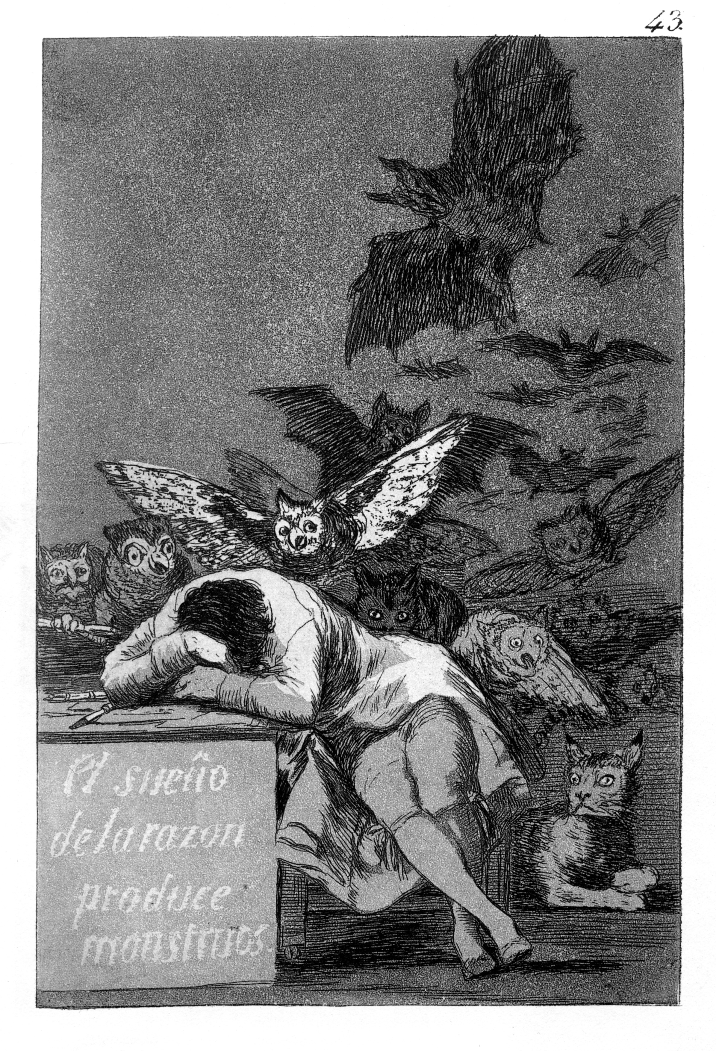
During our third week of class we examined some of Goya's Caprichos (two shown above). We spent a good deal of time during class looking into the use of light for emphasis and the movement of the light in a drawing to convey mood and manipulate how the observer looks at the piece. On all of these techniques, Goya is truly a master. 

The use of light and dark goes beyond shading, and expresses a mood of the figures in the pieces. Examples are the characters in the first Capricho and the beasts in the second. The moods and the intentions of the characters, in both examples are emphasized by their color and how dark they are in contrast to the rest of the piece. 

The use of light in the pieces also express the movement of the characters also brings the eye across the composition. In the first piece, we see the movement of the beautiful lady, as the eye is pulled across the page and drawn to the right side of the piece where it is the lightest. 


This piece was inspired by Goya's Caprichos, using like techniques with shading and the use of light to bring more emphasis out of the piece. I used light as an equivalent to "purity" in the piece and the black as the polar opposite. I'm not really sure what the main character is doing, but it was inspired by Capricho #43, and mimics the beasts above, with the faces of judging characters.

For this piece, I used basic shading and outlines to give my figure proportion and a basic look, working out early ideas before I started heavily shading. After the basic layout of my drawing I shaded and emphasized the feelings of the characters with unrealistically over shading. The background is dark or very light, specifically the table and document/art work is especially light, and the rest is dark to give a high contrast and bring the eye down the piece. The figure has white hair after his labors, under the judging eyes of the darker characters. I wanted to keep the head/hair as light as possible because the ideas of white, "pure," document is from his mind. I also like the contrast of the "pure" head and the characters body which I tried to model after one of Leonardo's Grotesques.

Week 2

Professor in Interior:


During week two we started to examine shading, motion and the uses of washing. We also examined how to anchor our models in space with the use of background detail. The piece is of our professor on a stool, using a wash for the expression of movement and shading, along with Rembrandt inspired shading utilizing crosshatching. 

I found it hard to anchor our model in the space. To anchor the model down I shaded and sketched the basic details of the stool she was sitting on, I also sketched a wall corner and another student in the background. I like how the stool gives her a base, but to really anchor her in the room the rest of the background is necessary. This was a harder technique because of the wash and absence of detail so as to not detract from the model. The amount of detail to add to the student in the background, to show that he is a student and not just a dark blob, was a difficult process and in the end I started to overwork the background and am not too pleased with how it turned out.

For the piece we started off with a rough wash meant to express motion, which is not how I usually work a drawing like this. I do like the introduction to a different method and found it useful when getting the feeling of moving models. However, for a stationary model, like out teacher, I don't agree with this approach.  I think that the proportion is off and could have been changed if I were to do a primary sketch. I found that I started to overwork the piece when trying to give it more proportion; that the wash was much more effective when used for shading, and then light crosshatching and dark crosshatching to really bring out detail in the piece.

Thursday, October 20, 2011

Week 1

Classmate Portraits:


HAR 394 is a figurative drawing class offered at Stevens Institute of Technology as part of our humanities program. Our first assignment was to draw a portrait of one of the other students in the class primarily focusing on proportion and scale. For the most part I stuck to the traditional proportions of a portrait with some modification in the nose mouth and chin to convey an expression rather than a more flat stern face. I also could have played with the width and lateral spacing of the face and eyes more, which I feel is lacking, rather than focusing so much on the horizontal proportions. 

I ended up liking my piece. It captures my model's expression so well and you can feel the emotion just coming out of the piece. Pieces always seem to be better in person, and there is always something that isn't conveyed when looking at pieces on the web; I am disappointed that the fine detail doesn't show though. Even in person at about 15 feet the really fine detail that I put into the piece isn't conveyed and is somewhat lost in the piece. I have a tenancy to do a really light fine detail that looks great when you are drawing and a foot away from the piece, but that isn't always conveyed when stepping back. 

I suppose that I learned that I have to start using a darker charcoal/pencil for larger pieces to convey more detail overall. I am torn because I like my lighter drawing style and have grown accustomed to it, and for a piece that I want to improve the mood of and feel lighter. I like light strokes which alleviates the heavy mood of a dark charcoal.